What changed, and why
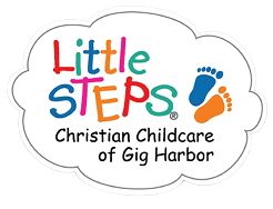
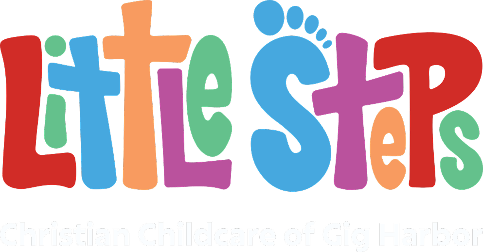
Cloud sticker → horizontal lockup
The old shape fought every rectangle it was placed in. A horizontal mark fits a website header, a sign, a banner, and an email signature without cropping.
Refined typography
Same hand-drawn warmth, better letterforms. The logo is legible at small sizes and cohesive across print and screen.
Kept the rainbow palette
Bright primaries and secondaries were the most recognizable thing about the original. Changing them would have thrown away years of parent recognition for no gain.
Full-color and single-color versions
The mark had to survive one-color embroidery, a vinyl decal, and a fax-quality permission slip. That constraint shaped the drawing from the start.
The result
A flexible identity ready for signage, apparel, web, and marketing materials. A system that still looks like the Little Steps families already know, while communicating what the center is about more clearly than the original ever did.

He communicates clearly, collaborates with genuine openness, and approaches our business needs with positivity and professionalism.
Have a logo people love that no longer works?
I refresh brand identities without throwing away the recognition you’ve already built. For childcare centers, schools and nonprofits around Gig Harbor and Tacoma. If a redesign is the wrong call, I’ll tell you that too.